Introduction
Over the course of this project, I learned a lot of valuable data analysis skills. Unlike previous assignments where we’re given initial information and build on it, we were starting completely from scratch. We had to find a dataset that would be compatible with the parameters of the assignment and produce substantive results. These parameters, therefore, imply that our data set entails multiple relational data columns that could each showcase a different aspect of the data. For example, we couldn’t show how 4 different variables are related to one dependent variable, it would have to be unique dependent variables. This posed a serious problem and ruled out what would otherwise be very interesting datasets. Moreover, the project requirements stipulated that we must have a time series plot, bar chart, histogram(statistical distribution), and a scatterplot. These visuals do not work with every type of data, so ensuring each of these charts were possible to create(an additional impediment). Eventually, we landed on the Tornado dataset, having all the necessary data we needed, including magnitude, location(latitude x longitude), injuries, fatalities, tornado width and length, etc.
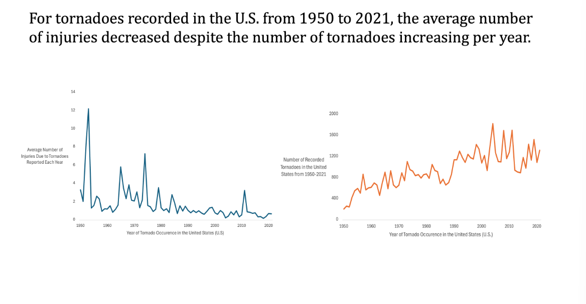
First Question
From 1950 to 2021, is there a change in the average number of injuries associated with the average number of tornadoes each year?
In order to create these time series charts, we first had to put the data into a pivot table for easy and convenient organization. In order to answer this question, we felt that it was best to create two time series charts. One with the injuries over time plotted to see if there’s a change in injuries over time, and also the occurrence of tornadoes vs time to see if a potential increase and injuries would be a result of an increase in tornadoes rather than time itself. Interestingly, injuries showed a steady trend down while the number of tornadoes showed a steady trend up. With the development of housing infrastructure and safety measures, the injuries make sense. But we were rather puzzled by the increase in tornadoes over time. We assumed it might be a consequence of climate change.
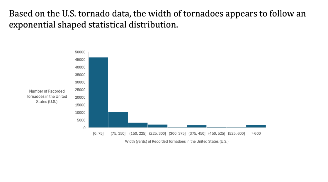
Second Question
Historically, what is the distribution of tornado widths?
To create this graph, we used a pivot table to filter the data to only include width. We then use a histogram to create a statistical distribution with the frequency of width in certain ranges. By default, the size of each bin was too small, so we enlarged the bins to increments of 75. We then added an overflow bin for the very small number of larger-width tornadoes.
Our results were that there is a proportionally large number of smaller-width tornadoes in the United States. This seems reasonable. However, our overflow bin suggests that there is a large proportion, relative to typical extreme deviations from the average width, of very large-width tornadoes. It seems to follow an exponential shape with a steep slope downwards. We used some small formatting tricks to make it visually appealing.
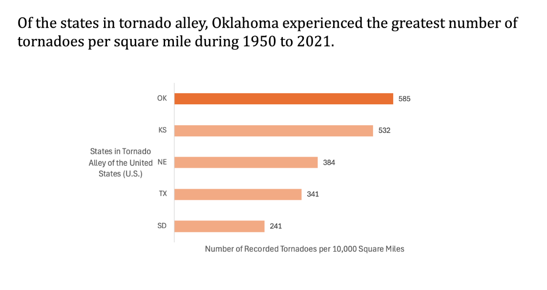
Third Question
Do the states in the Tornado Alley show similar patterns in tornado occurrences from 1950 to 2021, or are some consistently more affected than others?
We used a bar chart with our states in question to represent this data. To do this, we filtered by state, selecting only the states considered in the Tornado Alley strata, which are South Dakota, Texas, Nebraska, Kansas, and Oklahoma. We then used a pivot table with each of their respective count of Tornadoes as the values. However, because states like Texas, due to their size, might naturally have a skewed amount so we instead showed the amount of tornadoes per 10000 square miles. We divided the number of tornadoes in each state by the square mileage of each state, and multiplied by 10000 so the numbers were reasonably large.
To format, we added data bars to give the count at the end of each bar and shaded the top value, which was Oklahoma, to highlight it.
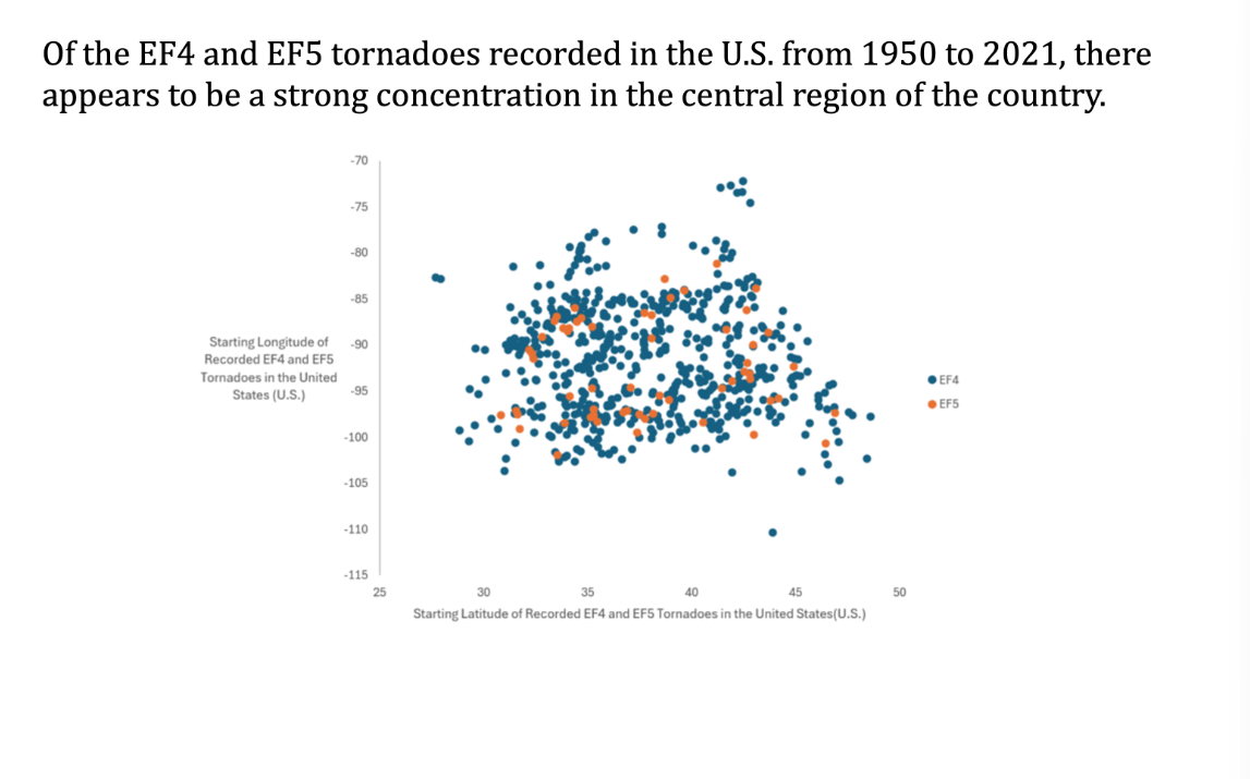
Fourth Question
Is there a geographical pattern of the most deadly tornadoes (EF4 and EF5) recorded in the U.S. from 1950 to 2021?
To develop this scatterplot, first, I had to filter the data by EF4 and EF5. I initially tried to use a pivot table. But because there were multiple occurrences for a particular latitude and longitude. So, each location key would have multiple points associated with it. This would not be as representative. So I used a simple filter in the main dataset and copied and pasted that data for EF4 and EF5. After a little research. I found out how to put two separate datasets with different colored plots to distinguish between the two, which was a nice learning experience, and is definitely something I will be able to use in the future. I formatted the chart by removing unnecessary gridlines that added clutter, added a legend, and added thorough axis titles for clarity. Based on the results, we were able to determine that there is a strong concentration of more violent and destructive tornadoes in the middle. Histogram: Historically, what is the distribution of tornado widths? For this, we highlighted the width column and plotted the histogram. Bar Chart: Do states in Tornado Alley show similar patterns in tornado occurrences from 1950 to 2021, or are some consistently more affected than others? Why This Data Matters: As climate change continues to shape our environment, its influence on the frequency and severity of natural disasters has become increasingly evident. This dataset offers a valuable opportunity to explore how tornado patterns have evolved over time. By analyzing trends in tornado occurrences, intensities, and impacts, we can ask critical questions that deepen our understanding of these extreme weather events—and the changing climate conditions behind them.